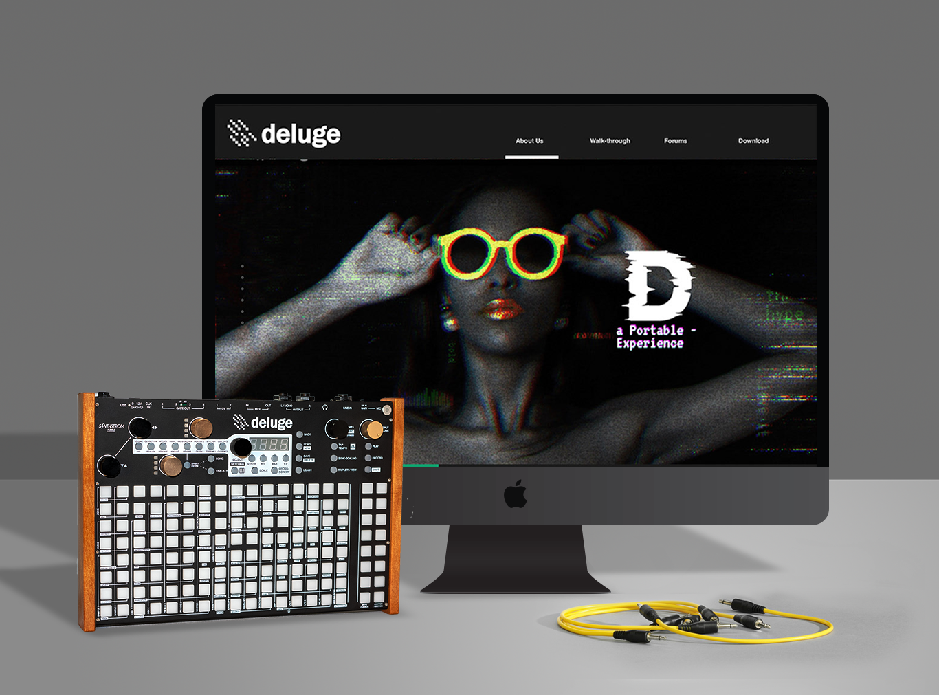
A portable synthesizer, sequencer, and sampler. Inspiring instrument yet their current website is very information-heavy. When I get to play with Deluge, I feel the disconnection between their website and this awesome instrument.
Opportunities
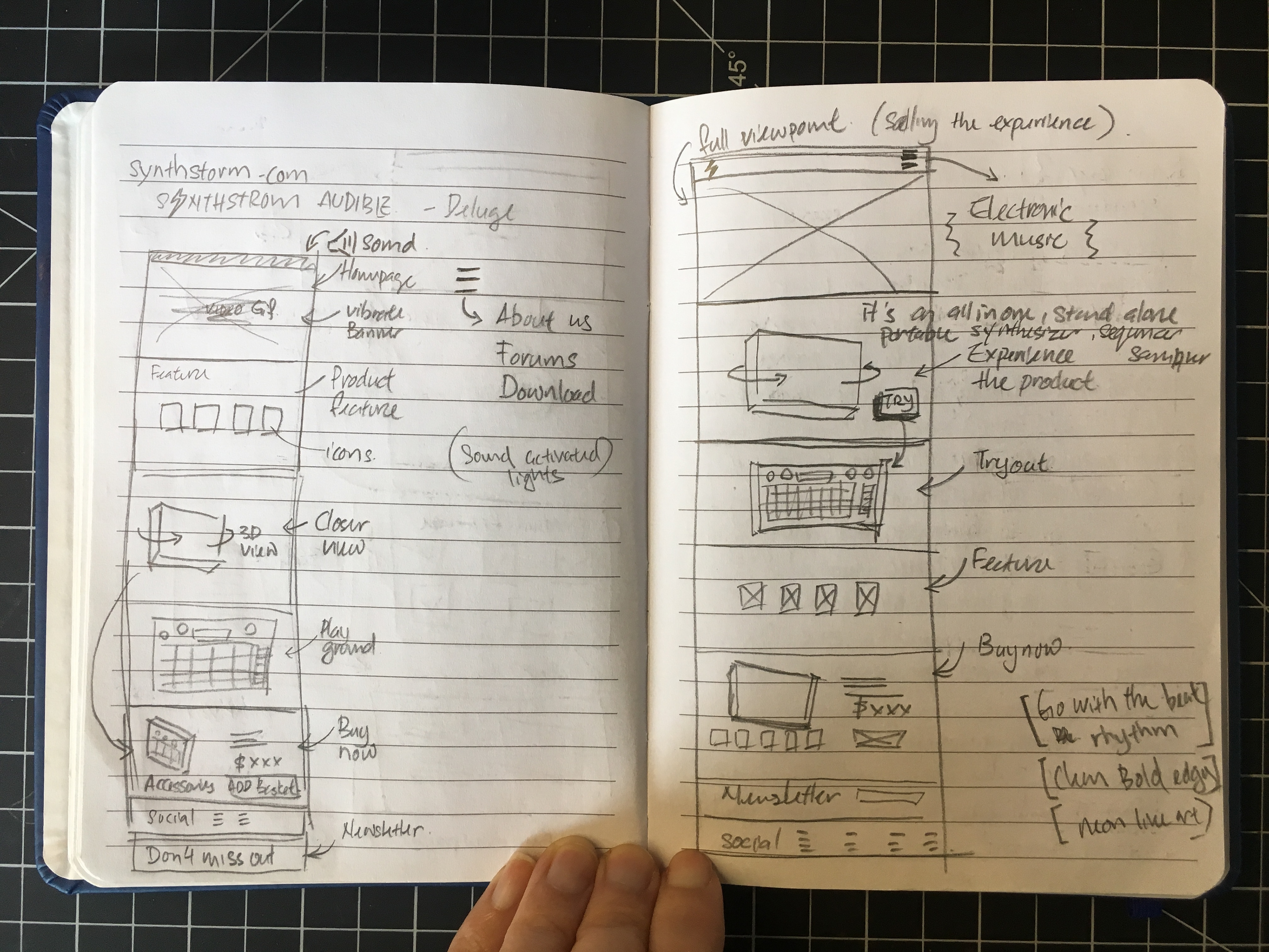
Hierarchy
// The current website heavily focuses on the functionality yet very language-driven.
// The current website heavily focuses on the functionality yet very language-driven.
Functionality
// Their best selling point not only the 3 main features but the fact that it's portable, it's small enough to bring anywhere, making music wherever you go, you don't have to hook on to a desk with a computer anymore.
// Their best selling point not only the 3 main features but the fact that it's portable, it's small enough to bring anywhere, making music wherever you go, you don't have to hook on to a desk with a computer anymore.
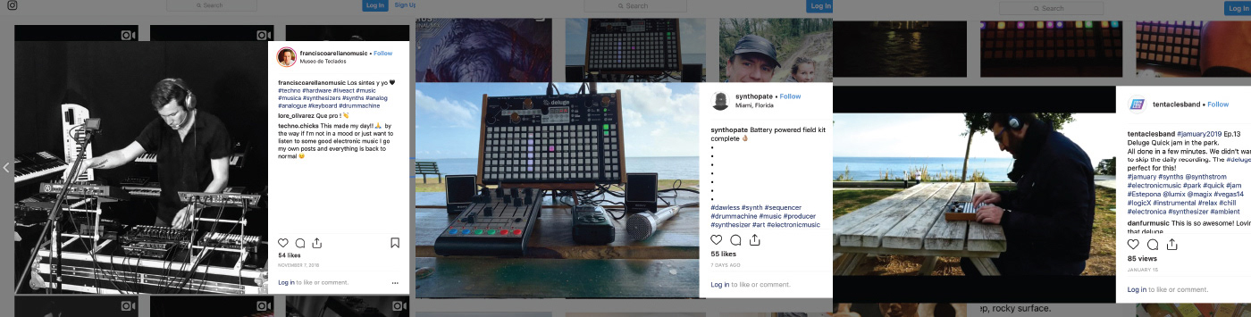
Understand Target Audience
// Apart from professional users, there are a lot of people brought Deluge out and making music outdoors.
// Apart from professional users, there are a lot of people brought Deluge out and making music outdoors.
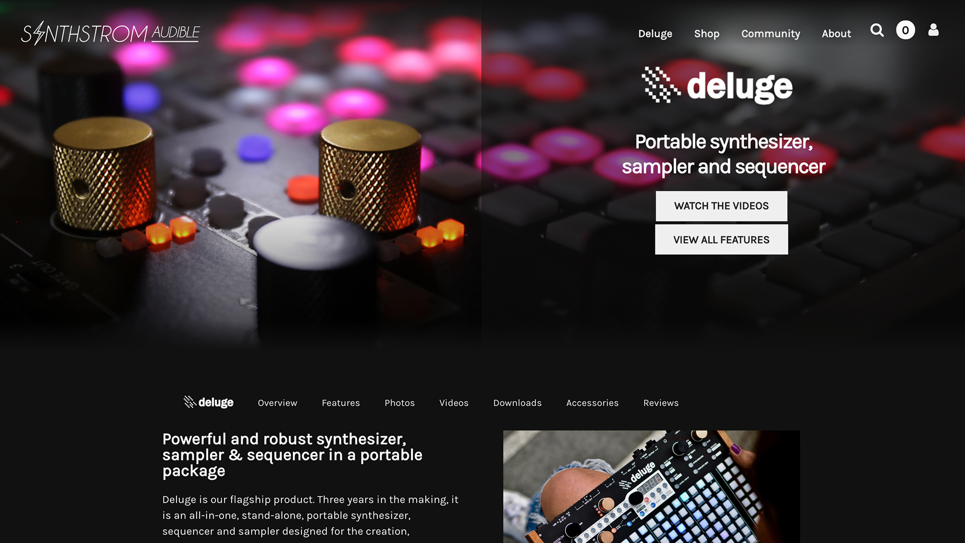
Their current website
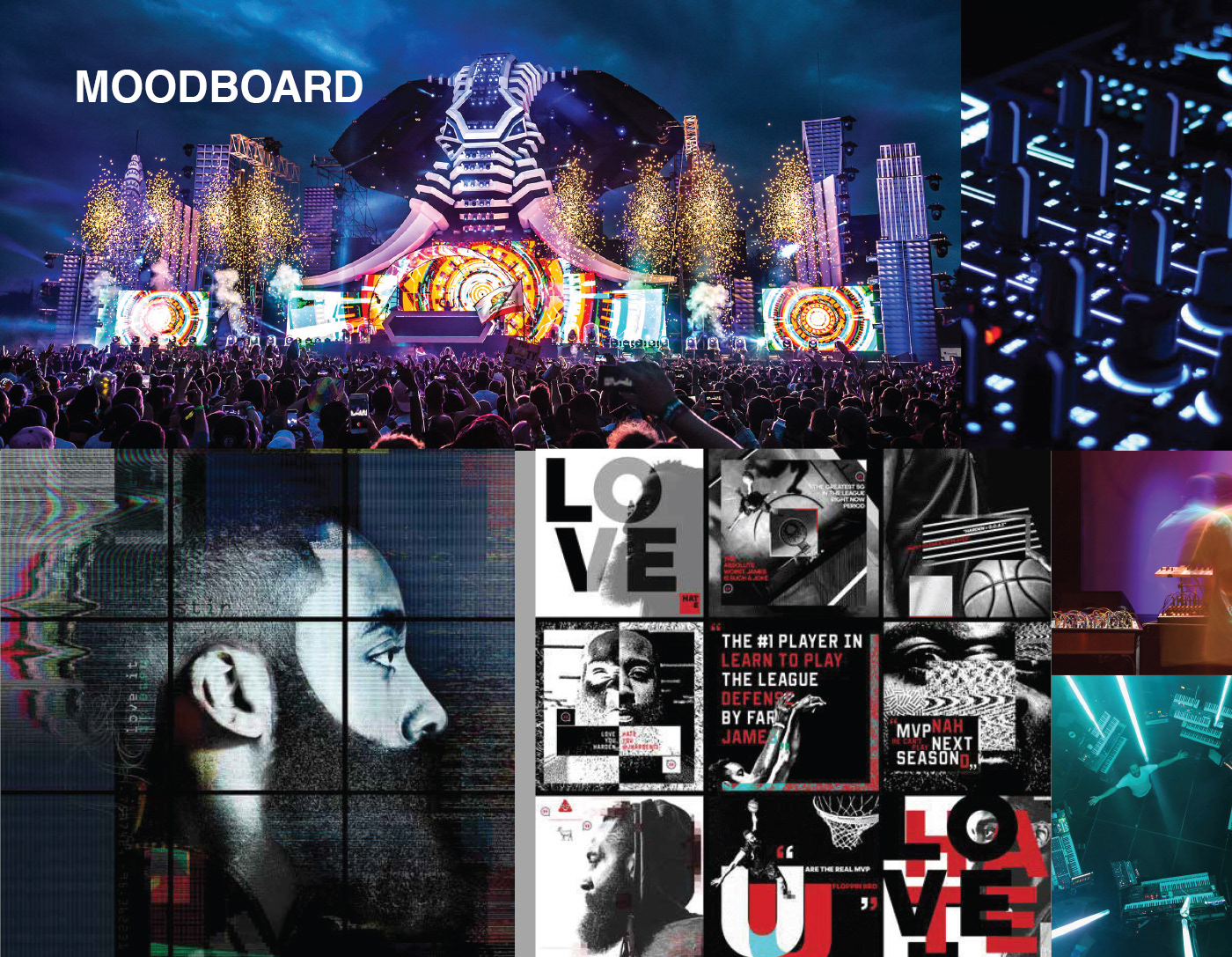
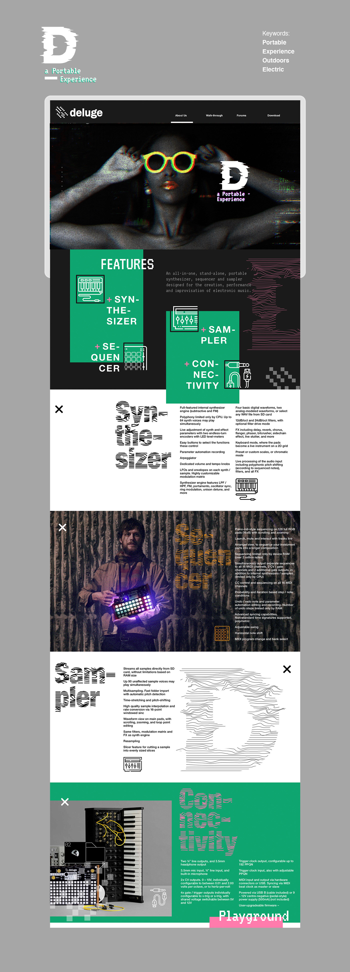
My approach is to bring the viewer the experience of electronic music through the website. I want the viewer to see and feel the vibe with visual, have you ever listen to a song that brings you into a zone and gives you goosebumps? I want to capture that experience.
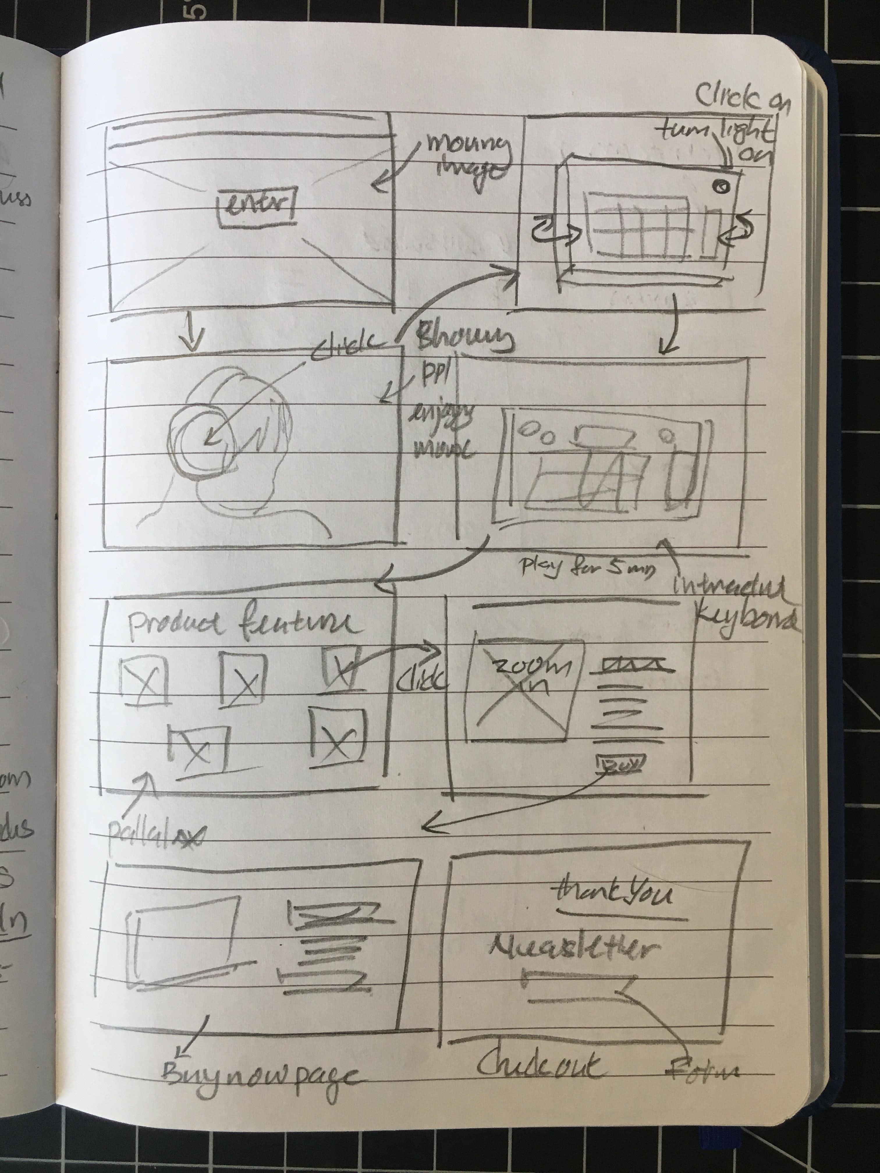
Execution 01
Execution 02
Concept
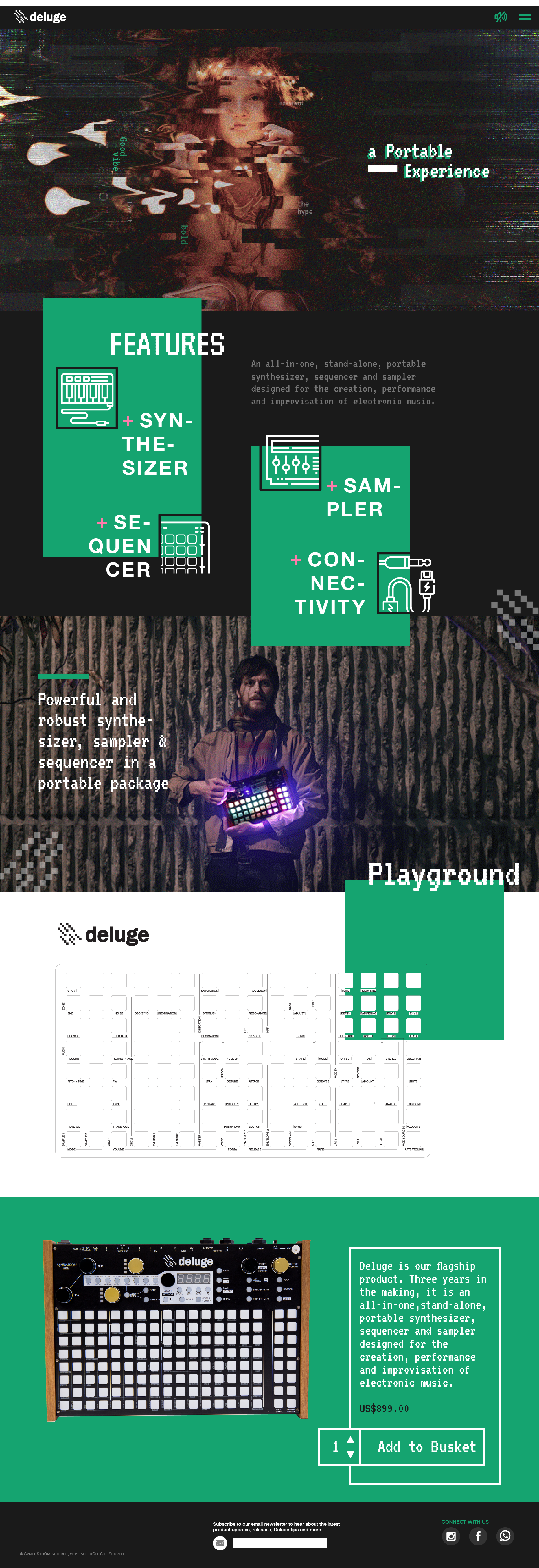
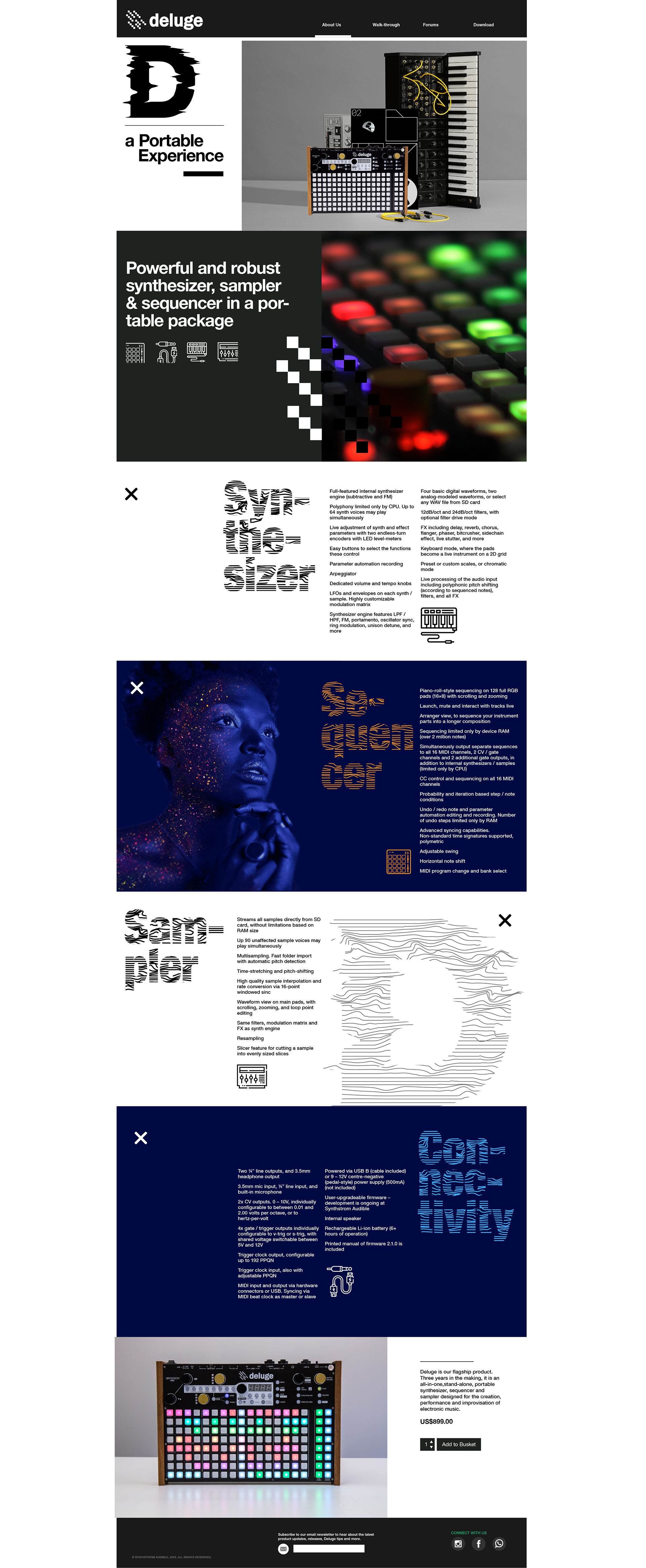
// Landing page - glitching picture to project the power of electric music, dim lighting gives a sense of mystery vibe
// Parallax movement gives a sense of depth & dimension because making music you are putting layers of sound elements from the Rhythm to Melody to Harmony and so on.
// Icon symbolize the features
// Everything out of box feeling freedom and contemporary
// Bright colors were inspired by the LED lights from Deluge
// Moving lines reflecting the sound rhythm
CSS / HTML website http://web.pdx.edu/~xuan/deluge/