I have decided to interview my new roommate Joshua who just moved into our place 2 months ago. While we’re talking he mentioned he went to China and stayed for 7 years. I think that could be very interesting to share his adventure through a simple zine. This is the main reason why I’m choosing him as my interviewee and I am grateful to his time and his materials support. At the same time, I’m challenging myself to visualize his journey from an audience who didn’t know much about him.
My goal is to translate his story with his perspective and abstract into a fun visual zine that readers will enjoy flipping through but not overwhelm with heavy information. I visualized a horizontal long time-line style fold to shows his journey throughout 7 years. However, printing something that larger than 17in will not fit into the cost-effective requirement, therefore testing out different fold was a fun experience. My chosen fold works perfectly with my vision and it also creates a fun paper plane fold in the center which is perfect for the story.
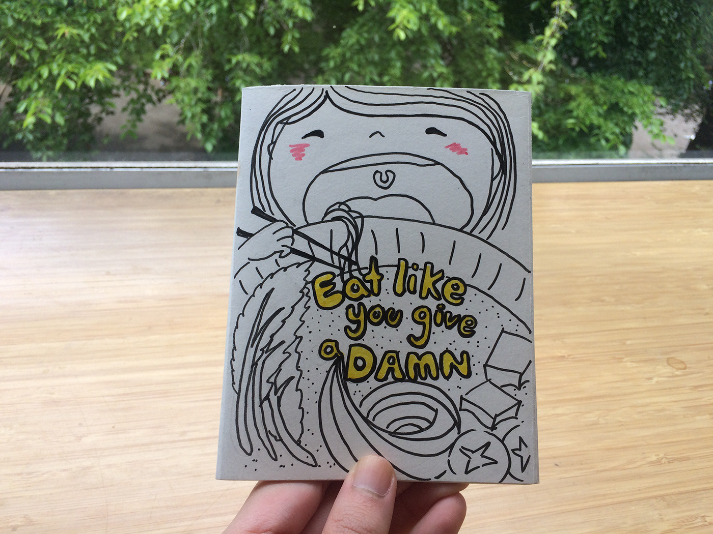
Regarding on the chosen style, I could show pictures after pictures throughout his journey but I thought to myself “who cares if it’s another picture book?” I want to personalize the contents so that it interacts with the audience. Therefore, I create a combination of hand-drawn illustrations and photographs as the overall style of this zine. The process was very time-consuming because after hand drawing the elements, I need to scan them into the computer and brush shadowing in Photoshop, then incorporate those illustrations with text in Ai. I’m using pastel brushes to create the uneven edges and it’s consistent with the organic feels of the hand-drawn illustrations. The original idea was to create everything in gray scale so that we can mess produce with photo-copy machine however, I believe a hint of color will kill the dryness and lift the mood, therefore I choose a light turquoise because it gives a feeling of young, fresh, playful and blend well between white paper and black ink.
During the interview, I ask him to write his name in Chinese and that is what I have on the cover as title, I think it gives the zine a little personal touch to incorporate his hand-writing into the design. Using a maps pattern throughout the cover to foreshadowing this is going to be a travel zine. One of my goals is to view this zine as a complete stranger who has no idea who is Josh, therefore, I’m using the very first page to briefly introduce him to set the scene, followed by the reason behind his bold decision to travel aboard. Then the journey started from the paper plane page, to keep the theme consistent I use the map to tell location and Chinese pattern cloud to infer China. We talked about challenges he faces in China and the first things he mentioned was being a vegan in China was a huge challenge. Therefore, I created a foods page to shows his struggle. After all the fun interactive pages, I finish off the zine with the entire stripe of the back as a time-line throughout his 7 years in China. I have also incorporated the line to steadily connecting United State and China on the covers.
Overall, I think this is a very fun project to challenge ourselves as a graphic designer to be able to translate other person’s story into visual communication zine.
