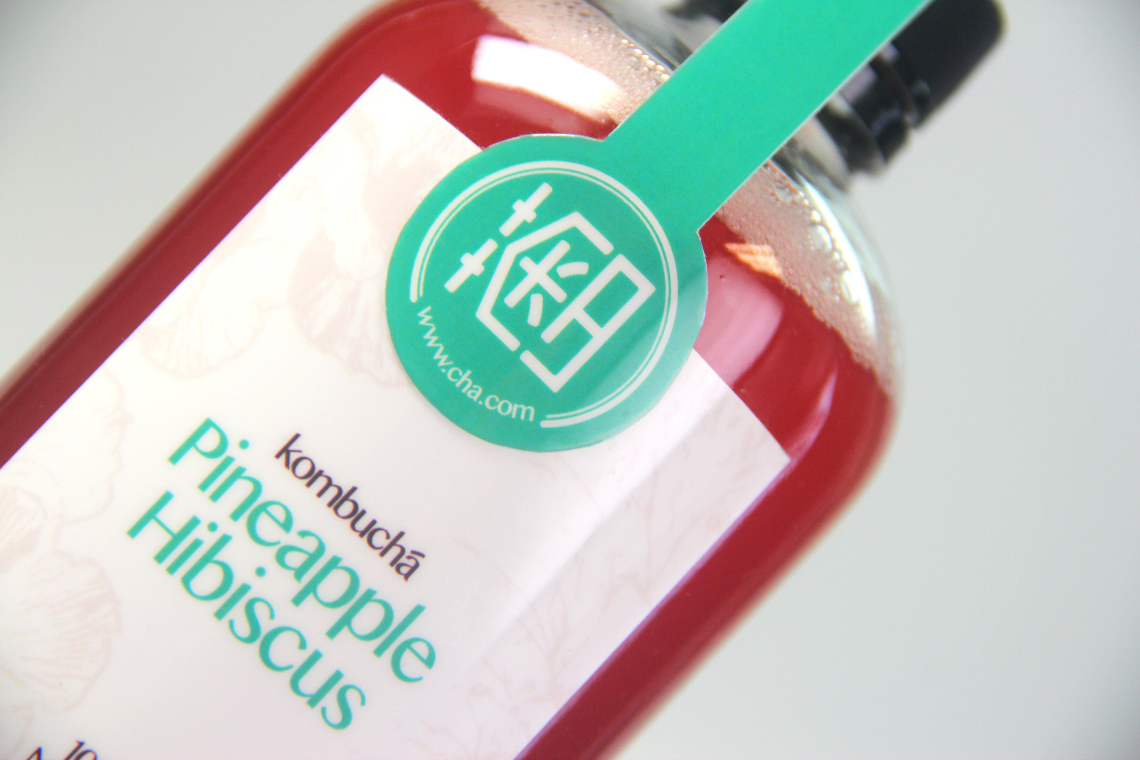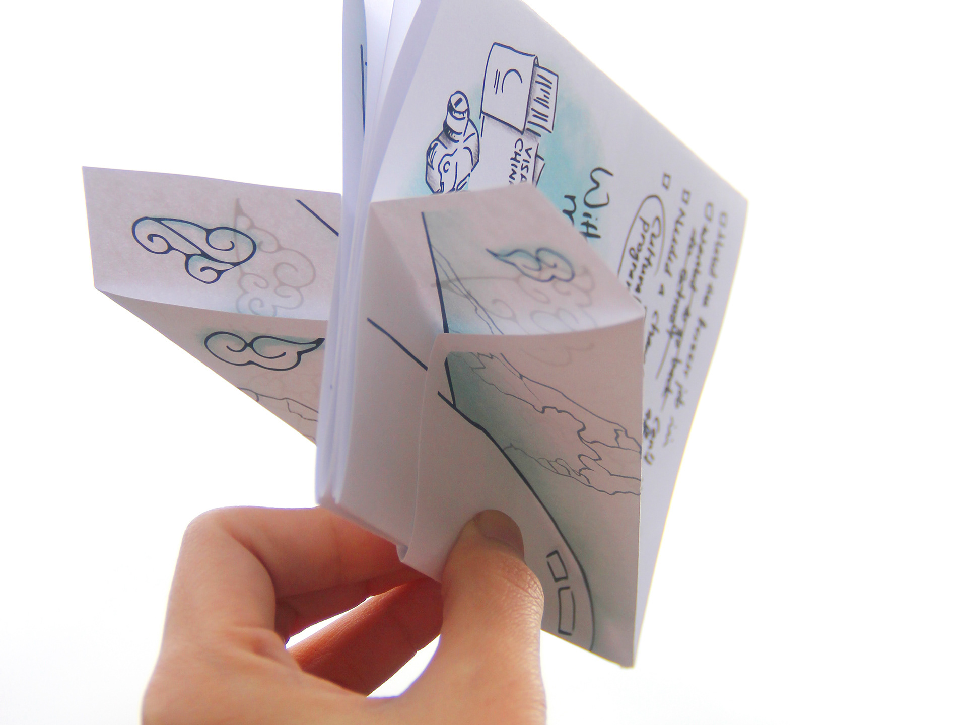
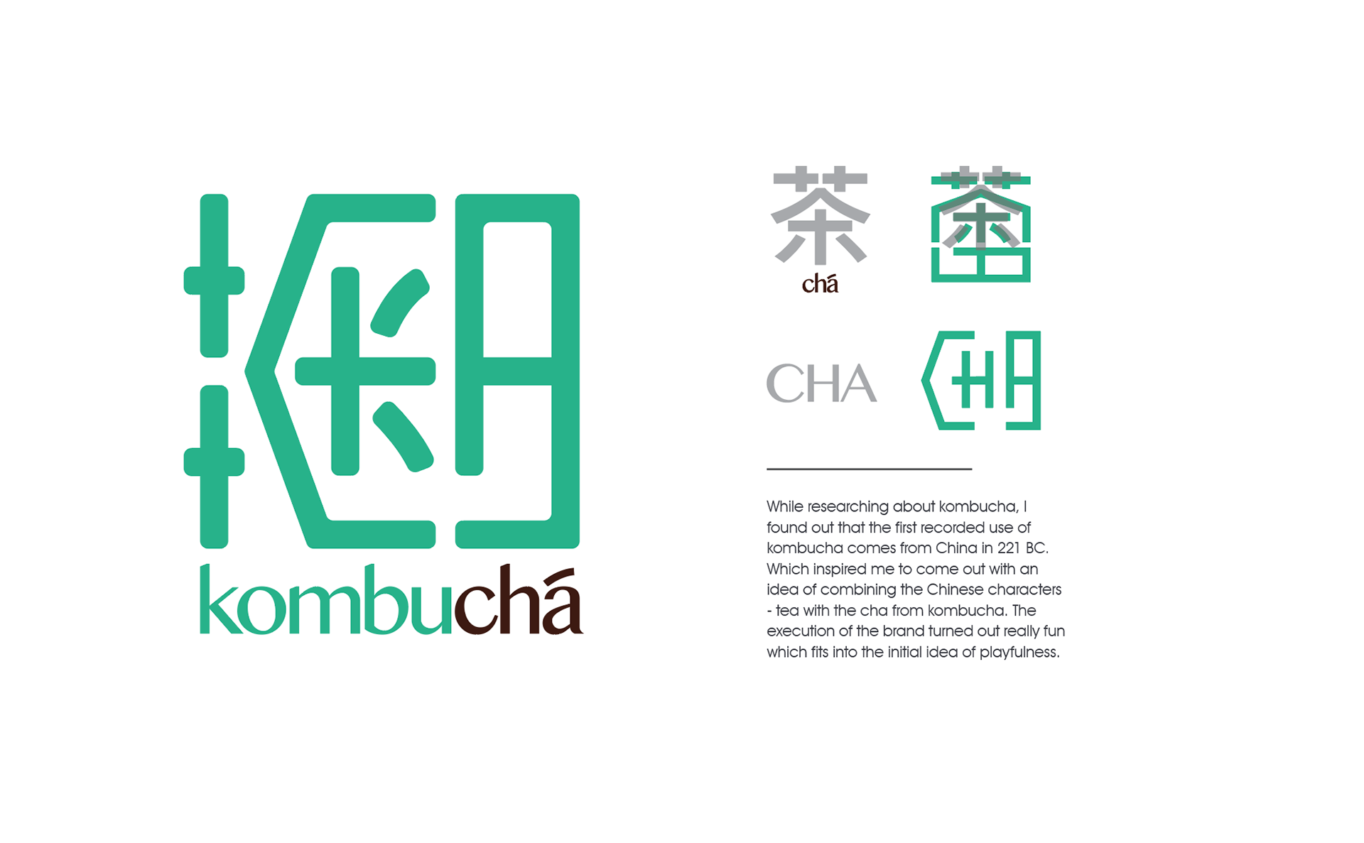
Created this brand with a goal of targeting the younger audience, having an idea of playfulness and most importantly stands out from the over-clouded kombucha market. Using bright colors, clean typography, and texture, I managed to find the balance of playfulness yet professional.
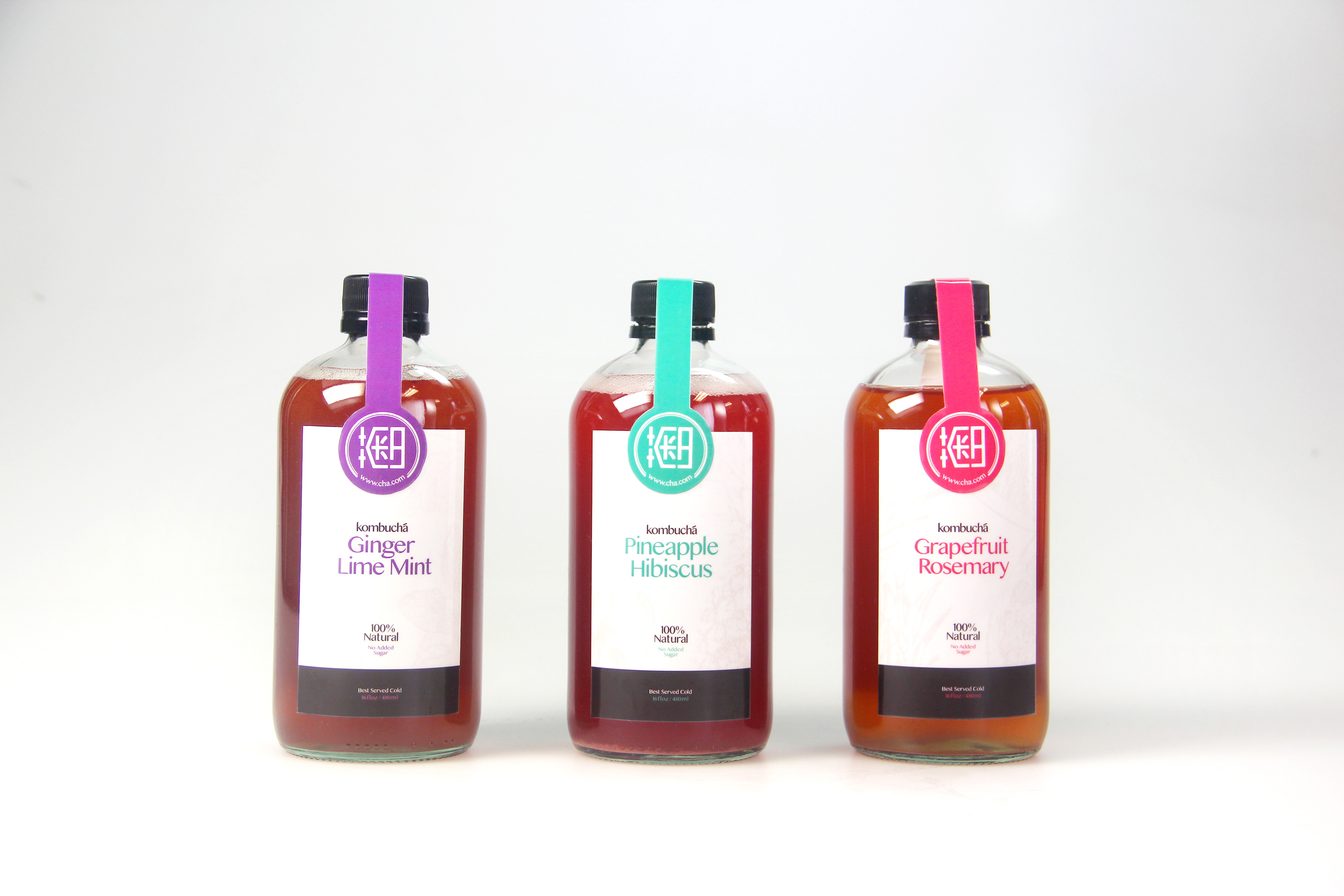
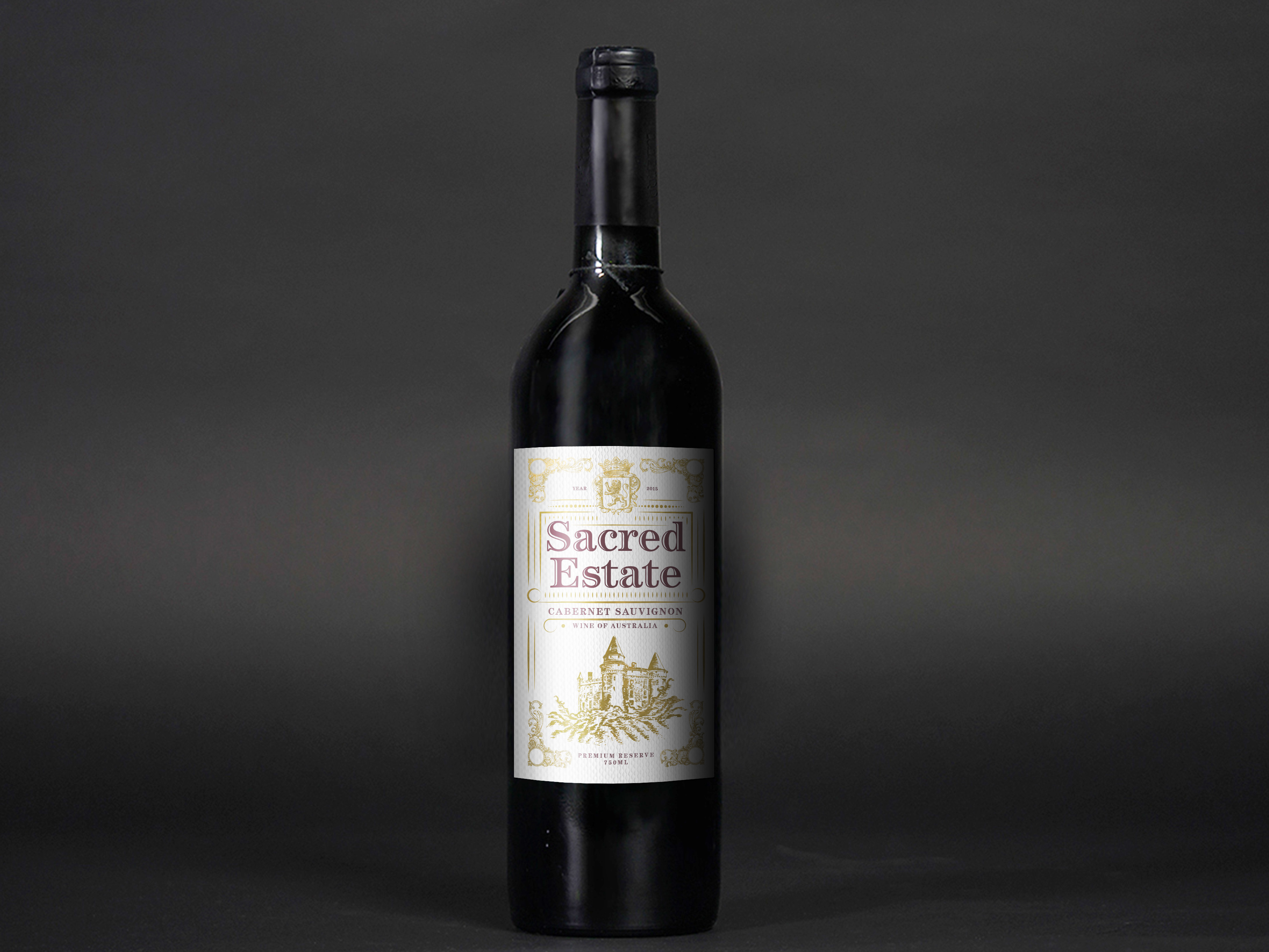
The beverage itself changes color depending on the flavor profile, therefore, I decided to use a white label to create a stronger contrast. The label not only emphasizes the natural colors of the drink yet, practically work as a template that could go well with any flavor profile in the long run.