Brief:
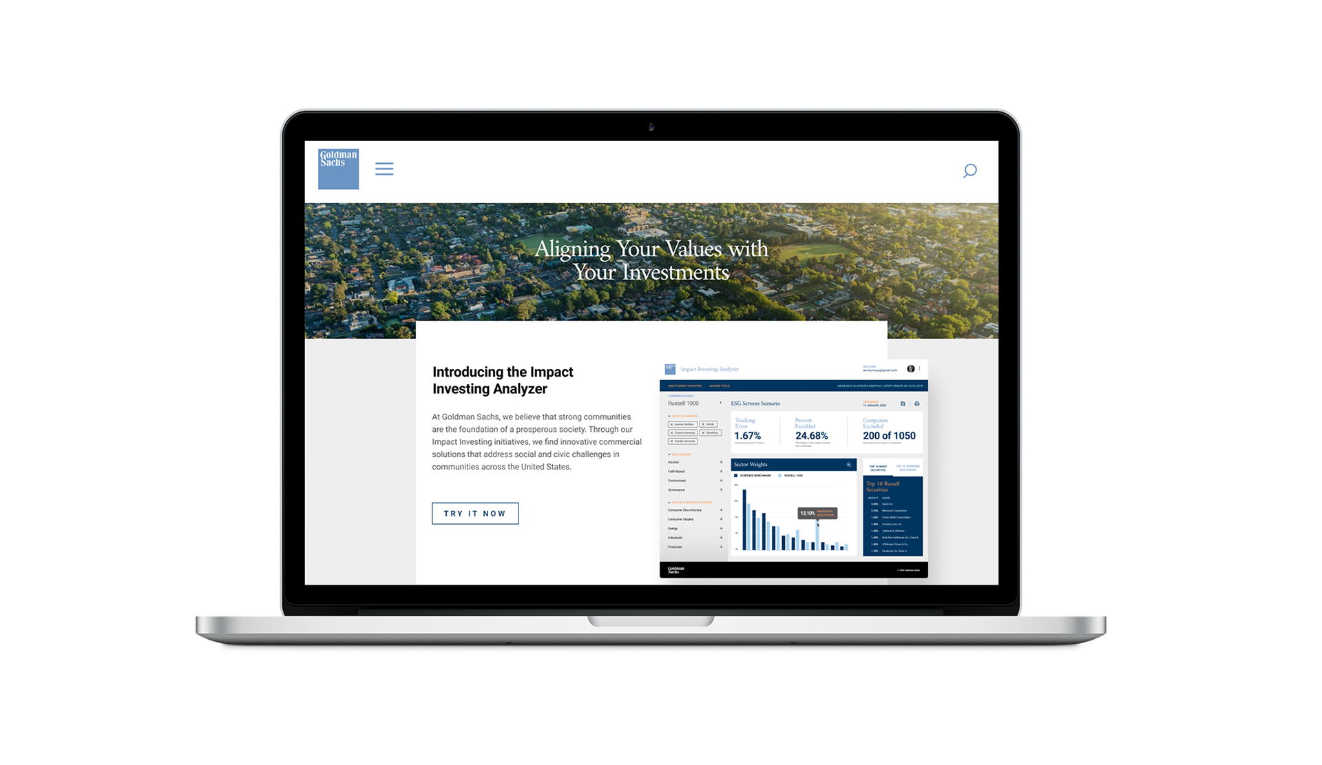
The goal is to translate the branding of a leading investment bank into a mobile product concept for sustainable investing. I chose Goldman Sachs because they are one of the largest banks that have adopted ESG / impact investing in the past 15 years.
The goal is to translate the branding of a leading investment bank into a mobile product concept for sustainable investing. I chose Goldman Sachs because they are one of the largest banks that have adopted ESG / impact investing in the past 15 years.
Disclaimer: This is a design concept and is not an actual Goldman Sachs product.
Opportunities:
Information Hierarchy
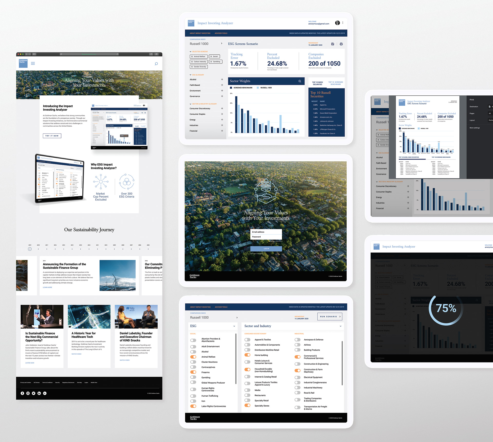
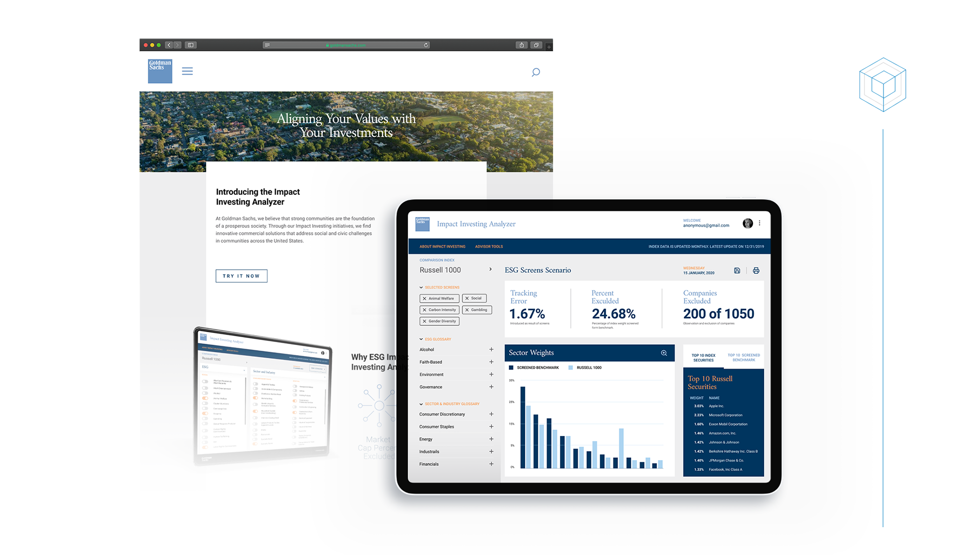
// Information hierarchy impacts how the user processes data on the screen. The dashboard is challenging because all the information is critical for understanding and a good information hierarchy helps users to better understand the priority.
// Information hierarchy impacts how the user processes data on the screen. The dashboard is challenging because all the information is critical for understanding and a good information hierarchy helps users to better understand the priority.
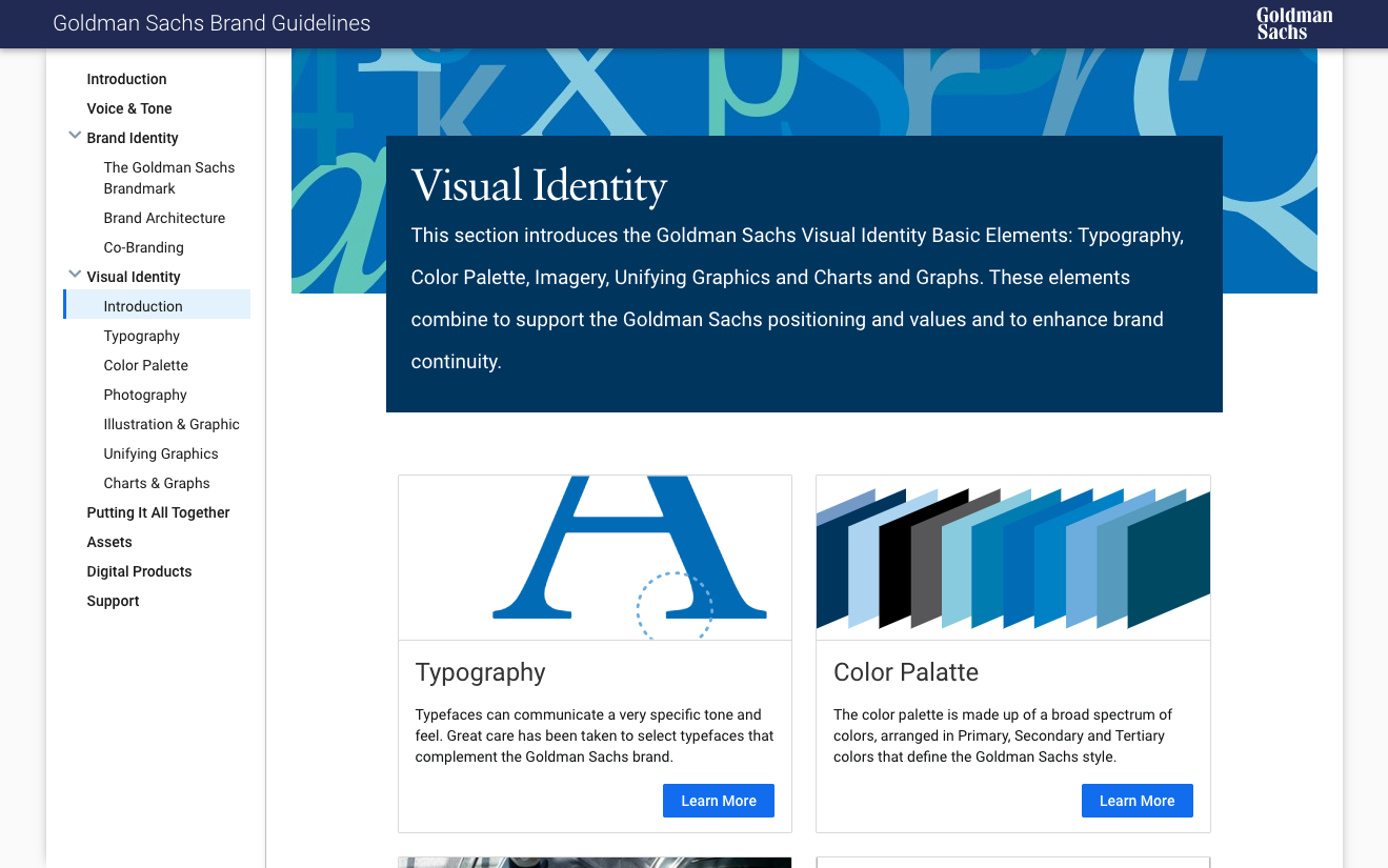
Colors
// Using the brand colors to differentiate data, sections, and categories helps users to navigate data visualization and retain focus.
// Using the brand colors to differentiate data, sections, and categories helps users to navigate data visualization and retain focus.
Contrast & Size
// Various sizing helps to create contrast while making the user interface easier to parse and scan. Adding white space to elements helps to calm a busy dashboard.
// Various sizing helps to create contrast while making the user interface easier to parse and scan. Adding white space to elements helps to calm a busy dashboard.
Challenges:
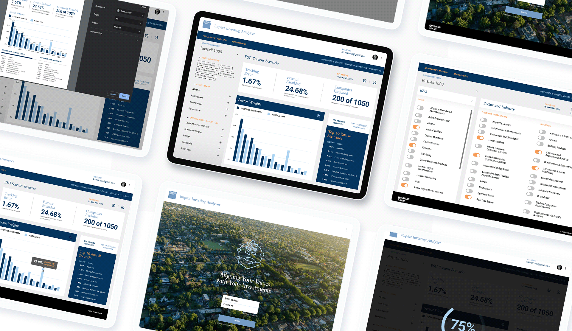
This assignment was to not only create an interface concept, but to also consider the overall information design and user experience. To fully understand the user interaction, I needed to gain a better comprehension of what the product fulfills.
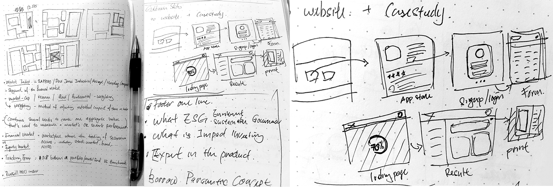
Approach:
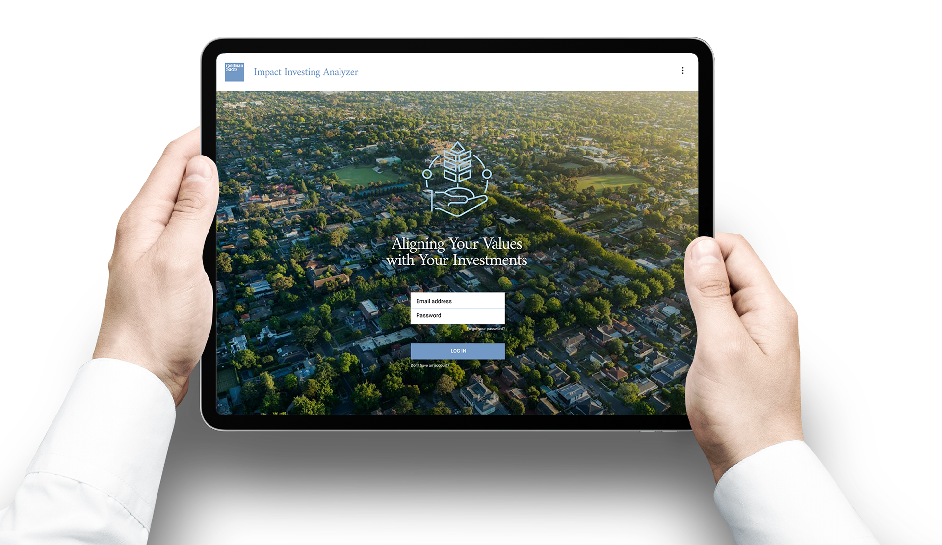
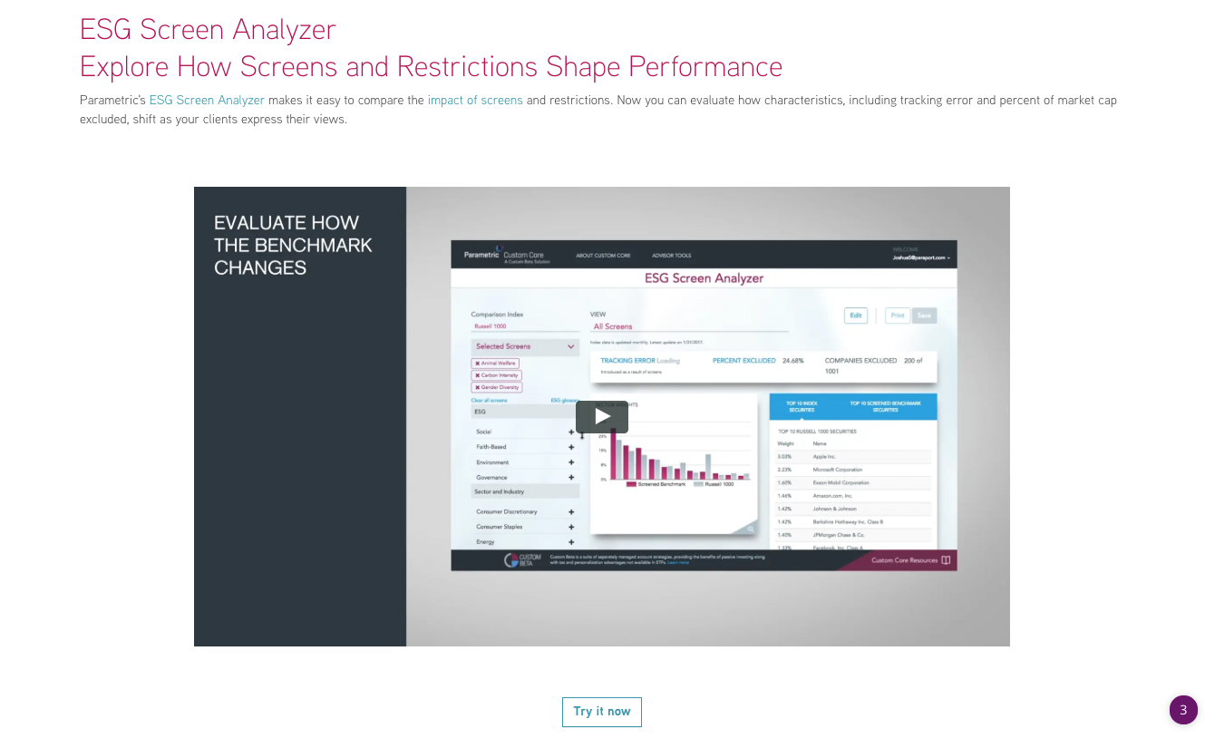
I did some research to get a basic understanding of an investment tool and the umbrella term of ESG investment. The Impact investing analyzer integrates social and environmental principles to the user's portfolio. Users can adjust the output by selecting different benchmarks for comparison. The dashboard makes it easy to evaluate how the portfolio may change according to the selected screens and prominently displays important information, such as tracking errors, percentage market cap exclusion as well as the number of securities removed.